
This map, a gameplay board for "Axis and Allies", courtesy of wizards.com, shows a general layout of the land owned by opposing forces involved in World War II. Some interesting features include the lower left-hand legend which shows broad estimates for troop movements for one turn of gameplay. Looking at this map and thinking strategically it is interesting to note the large presence of ocean on the map and consider how that effects gameplay, possibly making it more challenging for America to get involved in the war. In addition, the colors on the map divide the land masses into large territories, assigned to one of the major powers in the world at that time although these kinds of things were not so black and white. One may wonder, observing the spatial relationships between nations, whether it was possible for the war to take different turns, such as Japan decisively invading Australia.

This map, published by Matthew White on his website http://users.erols.com/mwhite28/ shows the population of the world relating to the portion of it which works in agricultural related jobs. It is interesting because we can discern things about countries which lack technological advancement. For instance, China is associated with manufacturing because many American consumer products are labeled "made in China", yet this map illustrates how, in 1992, the populus of China was still mostly involved in farming, contrary to what one might think. What made me particularly curious is the activity in the far North of the globe, because it shows that not only does this map describe the technological status of nations, but also partly the climate of regions. This is because the far North of the map has harsh climate conditions which probably make farming more difficult and force people into other careers.
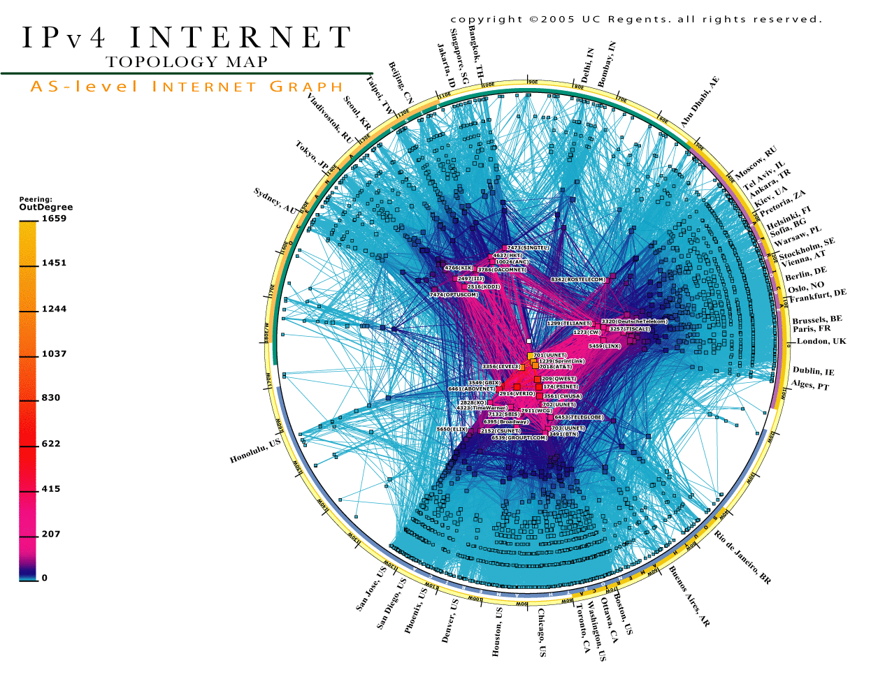
Published by The Cooperative Association for Internet Data Analysis (CAIDA), this map illustrates the network layout of the Internet. Each line on the map reflects the pairing of 2 infrastructural networking devices. It is interesting to note the great amount of connections near the bottom of the map because these correspond to internet nodes located in the United States. The map also shows how some nodes on the graph have a large degree of more pairing than others; for example, the ones toward the center. Similar mapping strategies have been used to create spatial diagrams of networks of friends on social networking websites such as Facebook. The mapmaker's use of color makes this map aesthetically pleasing, which is another reason to like it. Taking a second look, I find the offshoot to Hawaii particularly interesting because it shows there is a large presence of internet connectivity, and without knowing where Honolulu is, one may surmise that it is seperated from other large population centers because of the lack of nodes longitudinally nearby.
You can clearly tell how spatial data can be displayed in many different ways and cover lots of topics. I found it interesting that the board game map was so obviously not US centered. It is cut in half and small--something Americans are not used to!
ReplyDelete10/10