Thursday, April 15, 2010
Neogeography: A dynamic map of Awesome Coasters
View Great Rollercoasters in the US in a larger map
This is my map which spatially depicts the locations of the top roller coasters in the United States. Each label on the map contains information with the name of the rollercoaster, the park it's located in, the park's address, the park's phone number, and a video. The videos are the best feature because they allow the map user to take virtual rides on all of the roller coasters, without any annoying lines to wait in! A lot of these rollercoasters are located outside of California and I'd like to visit these great theme parks on the other side of the country someday.
After experimenting with neogeography I have found some of the pitfalls associated with the concept. Similar to wikipedia in the way that users generate content, the origins of the content are hard to verify. This means that the credibility of the information the map provides is questionable. In addition, the creator of a dynamic map may neglect to include time data, so information included in the map may be outdated and the map's users will not know. Also, map authors may leave out important information because their initial intentions are different than the use some end user finds for the map, causing users to be unknowledgable about crucial details. Despite all of these negative aspects, neogeographical systems can be a great resource and tool.
Thursday, April 8, 2010
Lab 2
These are the answers to questions for Lab 2
1) The name of the quadrangle is "Beverly Hills Quadrangle."
2) Adjacent quadrangles are called Canoga Park, Van Nuys, Burbank, Topanga, Hollywood, Venice, and Inglewood.
3) The quadrangle was first compiled in 1966.
4) The datum used to create the map is North American Datum of 1927, North American Datum of 1983.
5) The scale of the map is 1 : 24,000
6a) 5 Centimeters on the map is equal to 1.2 km on the ground.
6b) 5 Inches on the map is equal to 1.894 miles.
6c) One mile on the ground is equivalent to 2.64 inches on the map
6d) 3 km on the ground is equivalent to 12.5 cm on the map.
7) The contour interval is 20 ft
8) Approx coordinates of:
8a) Public Affairs Building: 118*26'30''E, 34*4'30''N
In decimal degrees: 118.44*E, 34.075*N
8b) tip of Santa Monica pier: 118*30'E, 34*30''N
In decimal degrees: 118.5*E, 34.5*N
8c) the Upper Franklin Canyon Reserve: 118*25'E, 34*N
In decimal degrees: 118.42*E, 34*N
9) The approximates elevations of:
9a) Greystone Mansion: 560 ft
9b) Woodlawn Cemetary: 140 ft
9c) Crestwood Hills Park: 700 ft
10) The UTM zone of the map is zone 11.
11) The UTM coordinates in the lower left are 362000m E, 3763000m N
12) Each UTM square is 1000 square meters
13)

14) The magnetic declination of the map is 14 degrees.
15) The water flows south in the stream between the 405 and Stone Canyon Reserve.
16) This is a crop out of UCLA from the USGS map:

Thursday, April 1, 2010
Interesting Maps

This map, a gameplay board for "Axis and Allies", courtesy of wizards.com, shows a general layout of the land owned by opposing forces involved in World War II. Some interesting features include the lower left-hand legend which shows broad estimates for troop movements for one turn of gameplay. Looking at this map and thinking strategically it is interesting to note the large presence of ocean on the map and consider how that effects gameplay, possibly making it more challenging for America to get involved in the war. In addition, the colors on the map divide the land masses into large territories, assigned to one of the major powers in the world at that time although these kinds of things were not so black and white. One may wonder, observing the spatial relationships between nations, whether it was possible for the war to take different turns, such as Japan decisively invading Australia.

This map, published by Matthew White on his website http://users.erols.com/mwhite28/ shows the population of the world relating to the portion of it which works in agricultural related jobs. It is interesting because we can discern things about countries which lack technological advancement. For instance, China is associated with manufacturing because many American consumer products are labeled "made in China", yet this map illustrates how, in 1992, the populus of China was still mostly involved in farming, contrary to what one might think. What made me particularly curious is the activity in the far North of the globe, because it shows that not only does this map describe the technological status of nations, but also partly the climate of regions. This is because the far North of the map has harsh climate conditions which probably make farming more difficult and force people into other careers.
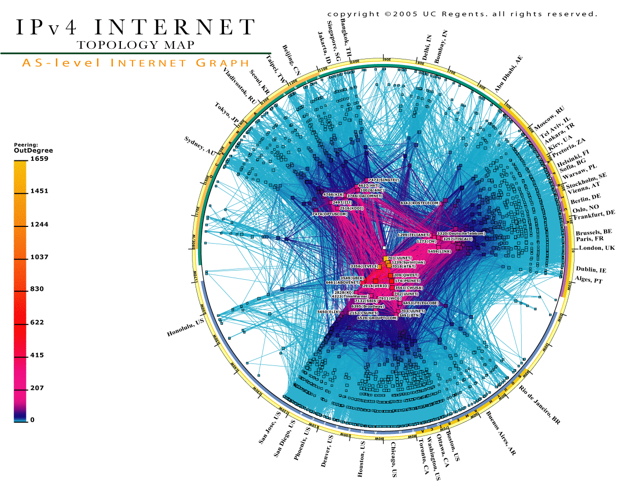
Published by The Cooperative Association for Internet Data Analysis (CAIDA), this map illustrates the network layout of the Internet. Each line on the map reflects the pairing of 2 infrastructural networking devices. It is interesting to note the great amount of connections near the bottom of the map because these correspond to internet nodes located in the United States. The map also shows how some nodes on the graph have a large degree of more pairing than others; for example, the ones toward the center. Similar mapping strategies have been used to create spatial diagrams of networks of friends on social networking websites such as Facebook. The mapmaker's use of color makes this map aesthetically pleasing, which is another reason to like it. Taking a second look, I find the offshoot to Hawaii particularly interesting because it shows there is a large presence of internet connectivity, and without knowing where Honolulu is, one may surmise that it is seperated from other large population centers because of the lack of nodes longitudinally nearby.
Subscribe to:
Comments (Atom)