Monday, May 31, 2010

Geography 7 Week 9

     This map shows the percentage of African American citizens by county as per the census in 2000. My analysis shows that the largest concentrations of Blacks are in the region of the United States called the "South" or the "Bible Belt".  I find it interesting that these percentages do not exceed 85% and would like to research  further for possible factors leading to that number. The western half of the United States has a pattern of fairly even distribution of counties with 25% or less Blacks. Also, the far north eastern part of the US located near Maine has a low Black population of less than 10% in that region.
     This map alternatively shows the percentage of Asian population by county in the contiguous United States. In my analysis I identified an interesting trend of high percentages in coastal areas, but there are many points that fall outside of this trend such as those found in the Midwest. One may consider the possibility of immigration factoring into this interesting distribution. Compared to the previous examples of Blacks, the areas of high Asian population percentage are of much lower values. Black percentages rose to 85% in some areas while Asian percentages only reach 36%.
     This map shows the percentage of White Americans per county in the continental United States based on the year 2000 census data. The analysis reveals patterns opposite to the previously identified patterns of African Americans and Asians. They are opposite because the highest percentages of White citizens are found away from the coasts and not in the Southeastern part of the country. Continuing research into these trends may consider the early expansion and colonization of America which began the spread of White Americans into these regions. Also the areas of highest percentage of Whites exceeds 98%, a much higher figure than the previously identified values for Blacks and Asians.
        All 3 of the posted maps show trends that seem to agree with each other. Where one races population percentage is high, the others are low. It would be interesting to overlay such data as numbers of registered voters to explore which communities are likely to vote on upcoming ballots. Similarly it may be interesting to compare these results to the electoral college results from the last presidential election. In all 3 maps, displaying the data in such a concise, visual way makes it much easier to identify spatial patterns in the idea to use in research and other applications. Since humans are visual creatures, visual displays of data are often much more powerful than raw data.
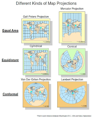
        After using geographic information systems (GIS) in multiple applications, the power of the tool has become clear. In each of my labs a large amount of data is involved which would bog down any researcher attempting to analyze the data without the aid of GIS. Thus, GIS allows people to process vast sets of spatial data quickly and easily and create meaningful maps. The computerized nature of GIS also increases accuracy of the results of analysis because all the data is computed not by the user at the keyboard, but internally. This also creates very accurate displays which are very useful for applications such as map projections, where hand drawn images may significantly lose accuracy. In conclusion, GIS is a very useful tool in the age of computing.

Thursday, May 27, 2010

Lab 7: Los Angeles, CA Station Fire

Reference Map:
Thematic Map:

Station Fire Research Report


     Lately wildfires have become an annual occurrence in the state of California, and all Californians are effected by them in some way and have learned to fear their destructive power. The Station Fire was no exception. This fire was a tragedy with lasting effects of the Los Angeles community. The fire was started by arsonist activities and eventually burned across 160,577 acres claiming 89 houses. 3 weeks before the blaze began, a memo was filled calling for cuts to spending on fire response assets. The Station fire serves as an example to why fire defense spending must not be cut, but rather increased in order to protect the lives and property of Californians.

     The flames threatened thousands of structures in the nearby cities of La Canada Flintridge, Glendale, Acton, La Crescenta, Littlerock, Altadena, Sunland, and Tujunga as seen on the above reference map. However, most of these areas were protected except for some homes lost in Tujunga. These victims demanded an investigation after the fact into why budgeting concerns existed and hindered the response of emergency personnel. It was found that some fire-fighting resources, such as a small helicopter, were withheld from the fight by the LA county fire department. Had the situation been different, these resources could have helped reduce the total structure damage of the fire.

     The Station fire also had serious effects on air quality in the surrounding area. Smoke advisories were published by The South Coast Air Quality Management District. A spokesman state that air quality in the foothill areas was potential. These areas are visible on the above themed map, illustrated by the digital elevation model data within a 10 mile buffer of the fire. Also, the school year was starting while the fire died down. The air quality prevented young students from being allowed to go outside during recess. The map clearly indicates many schools located within a 10 mile distance of the burn area. This area represents the likely highest concentration of smoke caused by the fire. The impact on the lives of school children only adds to the scope of the tragedy.

     By far the most tragic aspect of the Station Fire was the deaths of 2 brave firefighters. These men were honored by a memorial located at Dodger Stadium. 47-year-old Capt. Tedmund "Ted" Hall, and 35-year-old firefighter Specialist Arnaldo "Arnie" Quinones lost their lives and each one left behind a family. The men were stationed at a backcountry camp for inmates training in environmentalism. The heroes had set out to search for a safe escape route for all those trapped inside the camp when their truck plunged 800 feet into a ravine. Vice President Joe Biden spoke at ceremonies honoring the bravery of these 2 men.

     In conclusion, the Station Fire is an example of well funded fire-fighting programs are important, especially during California's fire season. Evacuations, air quality, and firefighter deaths were the primary areas where the community was effected. Hopefully legislators will learn from these events and make the proper judgment calls in order to protect the property and lives of California's citizens.


Works Cited

Bloomekatz, Ari B. "Air Quality Back to Normal in L.A. Basin - Los Angeles Times." Featured Articles From The Los Angeles Times. 15 Sept. 2009. Web. 27 May 2010. .

"Firefighters Honor 2 Comrades Killed in 'Station Fire' - KTLA." Los Angeles News and Video for Southern California - KTLA.COM - KTLA 5 - KTLA. 4 Sept. 2009. Web. 27 May 2010. .

"InciWeb the Incident Information System: Station Fire News Release." InciWeb the Incident Information System: Current Incidents. 8 Sept. 2009. Web. 27 May 2010. .

Pringle, Paul. "Before the Station Fire, a Cost-cutting Memo - Los Angeles Times." Featured Articles From The Los Angeles Times. 2 Oct. 2009. Web. 27 May 2010. .

Song, Jason. "Another Wildfire Victim: Outdoor Recess - Los Angeles Times." Featured Articles From The Los Angeles Times. 4 Sept. 2009. Web. 27 May 2010. .

"Station Fire Over La CaƱada Flintridge Threatens Thousands Of Homes - Cbs2.com." CBS 2 - KCAL 9 - Los Angeles - Southern California - LA Breaking News, Weather, Traffic, Sports - Cbs2.com. 30 Aug. 2009. Web. 27 May 2010. .

Thursday, May 13, 2010

Week 7: Digital Elevation Models Oahu

       I selected a section of USGS elevation data for Oahu, Hawaii because of the volcanic nature of the land.
The height of the area extends from 21.63* N to 21.28* N. Also, the width of the area spans from -158.23*E to -157.75*E. The total area is 2128.8 km^2. As you can see the elevation levels out quickly on the edges, this is because there is water there around the island.The raster is made up of 1860 columns and 1275 rows. Each cell is 0.000277* repeating in both dimensions. Also the RF scale is 1:239,084. The original coordinate system was latitude and longitudinal, but the map was projected using a UTM projection in order to add linear units to the map for calculating the slope data. The 1983 North American Datum was used.


Map 1: Shaded Relief Model
The shaded relief model is a color-ramped DEM layered over a color-ramped hillshade model. This combination creates a sort of topographic effect. 

Map 2: Slope Model
The slope model indicates steeper slopes with more intense colors. This model makes it easy to observe mountainous features, but could also be inverted to emphasize flat areas.

Map 3: Aspect Model
The aspect model is a display of the directions of each face of hills. This technique is helpful in interpreting from the map what the actual shapes of features look like in the real world.


3D Elevation Map
This is a color-ramped 3D model of Oahu. Having 3 dimensions allows us to analyze location based data in addition to Digital Elevation Models, without the other 3 techniques. This gives us the most accurate picture of the land features but is difficult to use for quantitative analysis.

Wednesday, May 12, 2010

Week 6 Lab


A Little Explanation:
    Map projections are a significant part of spatial analysis tools. They allow us to project 3-dimensional spatial objects onto 2-dimensional surfaces. This is a powerful tool because human beings observe data much better in 2 dimensions, for example, on a computer screen or a paper map. It is important to have different kinds of map projections because when transforming from 3d to 2d, not all detail is preserved, but the type of map projection allows us to determine which details are preserved.
    Equal area map projects preserve the details known as area. This means that taking a section of map area and comparing it to a different section, if their areas are equal, the represent the same amount of area on the ground. It may seem intuitive that all map projections should have this quality, but it is not the case. When looking at equal area maps, it may seem like they are not equal area at all because of the sheer size of Antarctica. However, if you compare the size of America you will see that big on the map doesn't necessarily mean big on the ground.
    Another type of map projections, equidistant, preserves distance rather than area. This means that the distances between points will be more accurate than other details. These kinds of maps would be desirable for spatial analysis focusing on distances between locations. As you can see, the cylindrical and conical kind look very different. You may wonder why the distances between the 2 cities vary since these are supposed to be equidistant. Equidistant only pertains to within the map, since each map may have a different scale.
    Conformal projection is the last type shown on my project. Conformal maps, rather than area or distance, seek to preserve the shapes details of land areas. Both the Van Der Griten and Lambert protections do this well, and as you can see they are both round. It is common for conformal maps to not be square, because the stretching that occurs when turning a spherical object into a rectangular one destroys the forms of the shapes. Conformal maps are useful for analysis pertaining to the shapes of countries and land masses.

Wednesday, May 5, 2010

Week 4: ArcGIS

This is my final map after going through all of the steps of Week 4's Lab:

     From my initial experiences with ArcGIS I can tell that it is an extremely complex tool with a lot of power. It seems like a user with expert proficiency would be able to organize a lot of data in a succinct way. However, the tool has a rather steep learning curve since it is so complex. For these reasons the applications of ArcGIS to spatial data and geoprocessing are limitless. 
     Because the tool is complex, beginning computer users will have trouble adjusting to the GUI. However, the documentation is very clear and helpful so most users can figure out how to use the features. Once figured out, there is a wide array of customizable objects, which are well organized within ArcGIS. The menu system used by ArcGIS makes usage fairly straighforward. 
     ArcGIS includes functionality which interprets scripting languages such as Python. Python is a popular programming language which is often used by graphical designers because of its simplicity, and many other fields of science for various applications. Because of python's widespread use, this additional functionality adds a great deal of power to ArcGIS. Also, researchers while find it easy to migrate their knowledge of Python to incorporate the ArcGIS API.
     The only problem I found with ArcGIS is the default color scheme which is very bland and boring like the old colors used in Microsoft Office 2003. The color schemes are entirely customizable but it takes a little bit of work to change the colors from their default values. Other aspects of the program such as shaping and aligning elements are very simple. Overall, ArcGIS is a well designed piece of software, and I have yet to run into any bugs or crashes.